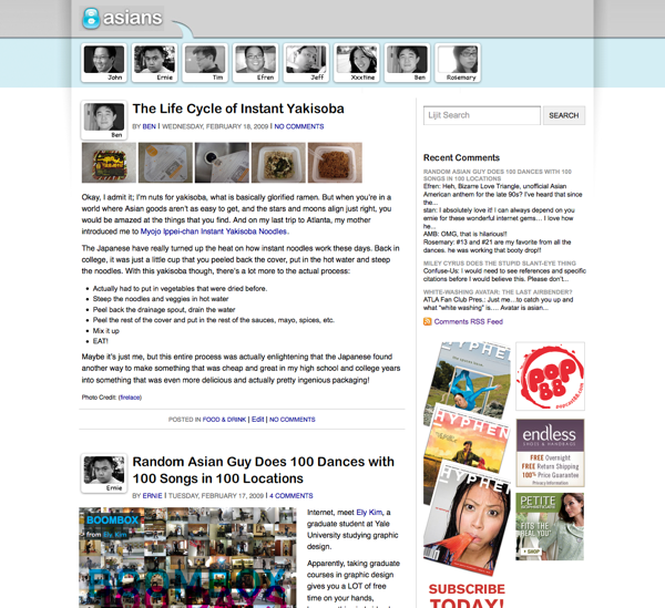
So if you are visiting the website and you’re not using an RSS Feed Reader, you may have noticed some, uhm, subtle differences to the 8Asians. Like the fact that we completely redesigned the website.

Truth is, we didn’t expect to get the redesign out this early — a version of this had been sitting on Ernie’s hard drive, but when a recent upgrade of my blogging software went terribly wrong, a cardinal sin of web development had also been committed: forgetting to making back-ups of the existing design.
That means a lot of stuff was lost, folks. But it also means that redesigning 8Asians.com — something that was previously on the back burner while Ernie worked on other things on Life’s To-Do List — suddenly became a very urgent thing to finish.
But no matter. The point is that the new 8Asians.com looks a bit different, and has been redesigned with these goals in mind:
- Less clutter: blog entries and comments have bigger fonts, wider space and should be easier to read
- Everything is centered instead of left-justified: By popular request! (Okay, one person complained about it.)
- Smarter about blog ads: here’s a secret; if you want the ads all over the blog to magically disappear, just comment on the blog! (Our comment policy still applies, however.)
The redesign of 8Asians.com is far from being finished and the website will look different in five days, and the five days after that; that said, we’re open to constructive criticism, suggestions, at the very least, if we’re on the right path to redesign greatness. Let us know!


