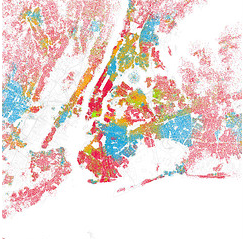
 I came across an article today in Fast Company discussing how much racial segregation exists in the top cities in the U.S., and the article referred to some very interesting maps. The maps started with Bill Rankin, a cartographer, who created a map of Chicago, which showed very distinctly the city’s inner boundaries based on racial groups. The map used colors to represent each of the various racial groups, red for Caucasians, blue for African Americans, Green for Asians, Orange for Hispanics, and gray for other.
Eric Fischer saw Rankin’s maps, and created similar ones for the top 40 cities in the United States. Fischer borrowed Rankin’s methodology using U.S. Census data from 2000, where one dot equals 25 people. His color codes are the same as Rankin’s.
As you can tell from the different maps, each city has its own level of integration in its various neighborhoods. It was no surprise you’d see sections that are primarily Asian in parts of the Bay Area, New York and Los Angeles. What surprised me more was in the Bay Area, specifically around Cupertino, the map wasn’t as green as I’d expect it to be for a city that has a largely Asian population. The diversity level seems pretty high, and instead what surprised me, was that it was much “greener” (more Asian) in the eastern parts of the South Bay.
While you can’t change your neighbors, if you happen to live in one of the top 40 cities in the U.S. you can get a view of how diverse your neighborhood happens to be.


